Like many others, I went through the usual art classes at school. But even before I took my first such class, someone may have told me that you mix yellow and blue pigments to make green. These joyful discoveries were made systematic in the art classes where we learnt how the primary colours of pigments are red, yellow, and blue. This was so ingrained in my thinking that I completely ignored the writings of Seurat even after I discovered his pointillist techniques later in school.
I could have paid attention when my science teacher tried to tell us that the primary colours of light are different: red, blue, and green. When I did not, it was a steep learning curve for me as I grew interested in the stage during my years in college. I laboured at producing colours of light for plays using a completely wrong model for colours. I remembered the great surprise I had in producing a cold grey light for use in a play by mixing floods and spotlights. It was around then that I discarded the theory which worked for pigments.
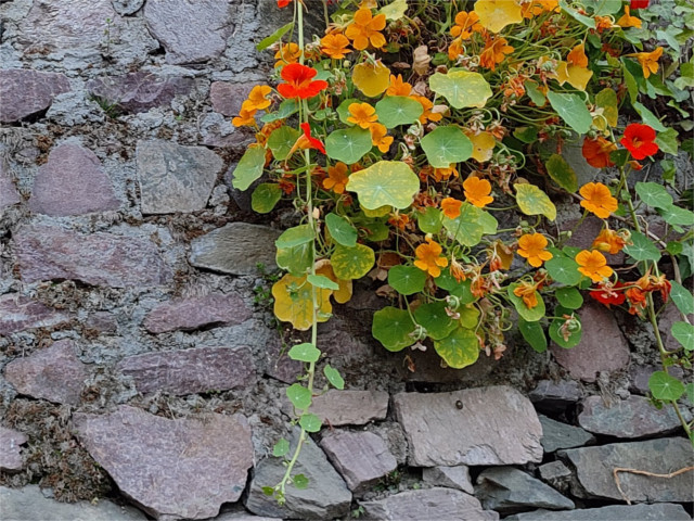
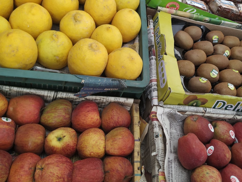
Now, of course, as we learn to use software for editing photos, the use of RGB colours has become so widespread that Seurat’s discoveries about colour seem commonplace. Still, when I discovered this spring that leaves use the same method I felt the pleasant tingling of discovery. The underlying colour of many leaves is red. The green colour is due to chloroplasts that the leaves produce to perform photosynthesis. When leaves die and the chloroplasts begin to decay, leaves turn yellow. If they don’t rot quickly you see them turning red as more and more chloroplasts die. In spring you see this in reverse. New leaves start out red, and grow chloroplasts, first turning yellow, and then green in a reversal of the changes that autumn brings. The first two photos in this post are of this transformation in new leaves. The photo above shows the changes in dying leaves.
An old friend, once an artist in his spare time, took a job which involved printers and the design of colours. As he worked with software and printers, trying to reproduce the colours produced in one domain in another, his interest in colour vision and reproduction grew. I listened to him talk about how subtractive schemes like CMY correspond to the print experience better, and what happens if you add on black ink. Now he spends much more of his time on his art, but spared some time to talk about what he found.
Colour vision is a property of human physiology and perception. So the fact that our eyes have receptors, the rods and cones, is part of the story. But behind this is a layer of computational nerves, a neural network, which combines the signals from these, and feeds it to yet other nerve cells which then transmit the information, through our optic nerves, to specialized areas in our brains. It is hard to believe how we see! Birds and insects see the world very differently. Photos of flowers or butterflies’ wings taken at wavelengths invisible to us show incredible patterns. This is an indication that in the ecology in which they exist, markers visible to non-humans are important. It is amazing how much detail the world shows once you zoom in to any part of it.


Beautiful
LikeLiked by 1 person
Interesting and informative. I knew about the decaying leaves and colours, but many other things were new to me. I am glad you share your knowledge and make us think even more about the world and its wonders. my son works some with prints, so I love the way colours work.
LikeLiked by 1 person
Thanks. People who work with prints have fascinating tidbits of stories about colour.
LikeLike
Nice and creative way to connect the not-so-obvious 🙂
LikeLiked by 1 person
thanks
LikeLiked by 1 person
Excellent, and informative!
LikeLiked by 1 person
Thanks
LikeLiked by 1 person
There are the additive primaries and the subtractive primaries. Additive primaries are the familiar RGB of the computer monitor. Subtractive primaries are yellow, cyan, and magenta. You see this used in printing and old silver-based color film. This is the origin of the CMYK color scheme, where k is black.
Because early printers weren’t thinking like physicists, cyan became blue and magenta became red because of their perception. As time went on it became necessary to distinguish between the two versions of red and blue. Magenta became “process red” and “cyan became process blue.”
When I tried transferring my photography knowledge to the world of advertising it all became insanely confusing. Print media all referred to “process” colors. Photography used mostly subtractive primaries. Television used additive primary colors.
LikeLiked by 1 person
Yes, colour coordinates can be confusing, but it is not science. The only science here is the neuro-physiology, and we understand so little of that.
LikeLiked by 1 person
I love this post.
LikeLiked by 1 person
Thank you
LikeLiked by 1 person
Thank you for sharing your knowledge of colors. Well explained, IJ.
I enjoyed this image series. 🙂
LikeLiked by 1 person
Thank you
LikeLike
So true, IJ–about the amount of detail in the visible world. I remember my first look at a slide under a microscope and being astounded at the life “swimming” in the viscous fluid! I admire your artistic and scientific mind and your curiosity! Your insights into the way leaves change color in spring and autumn are a gift. Thanks!
LikeLiked by 1 person
Thanks. Happy to share. The colours of spring in the Himalayas are spectacular, and I had to find out why. Glad you enjoyed it
LikeLike
A most interesting take on the subject I.J. Enjoyed learning about your color experiences. Who knew the challenge could be educational as well ?!
LikeLiked by 1 person
A nicely illustrated science lesson.
LikeLiked by 1 person
🙂
LikeLiked by 1 person